
Do you want to know how to link your conversion reporting from AdWords & Facebook into one easy to ready report? Read this to find out a free solution from Google.
Today we are going to be building an AdWords & Facebook cost per conversion report using Google Data Studio. This will provide an easy real-time report to view how much it costs you to get a website visitor to convert by the overall accounts, campaigns, and ad groups/ad sets. Make sure you are logged in using the email that you use for your AdWords & Facebook marketing campaigns so that Data Studio can pull the information.
Watch the Online Marketing Techs instructional video or follow the step by step below.
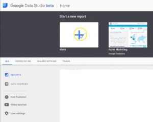
First, we will select start a new report.
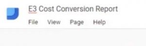
Then we will name it. I will name this one E3 Cost Conversion Report.
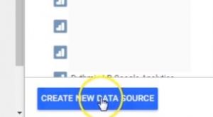
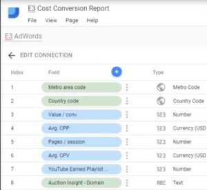
Then we will need to create a new data source.
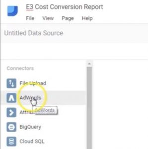
Select your AdWords account and connect.

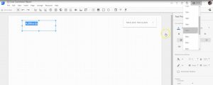
Name your data source and add to report.
![]()
Click on the Insert menu and select the Date range
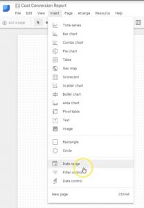
Select the text option from the drop-down menu
![]()
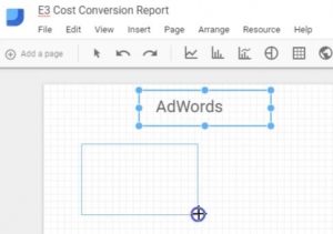
Draw a text box and label it AdWords. You can change the text properties in the property settings on the right-hand side.
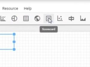
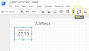
Select the scorecard icon and draw out an icon box.
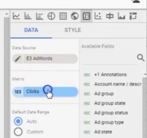
Select the metric picker from the right side of the screen.
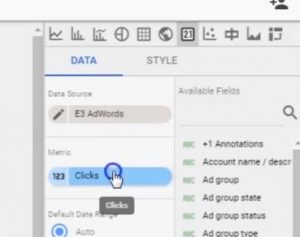
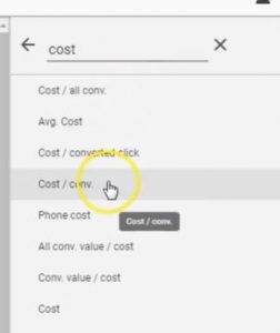
Search for Cost/conv. from the search bar and select the metric.
Select the scorecard icon and draw another icon box.
![]()
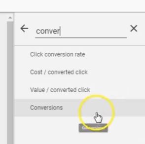
Select the metric picker, search for conversions, and click on the metric.
Select the scorecard icon and draw another icon box.
![]()
![]()
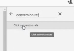
Select the metric picker and search for click conversion rate.
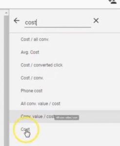
Draw another scorecard, select the metric picker, and search cost.
Select table icon and draw a table box.
![]()
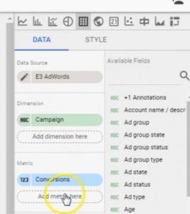
Go to metric picker and search cost/conv.
Now add a metric to the table and search for conversions
Add another metric and search for click conversion rate.
Add another metric and search cost.
Copy table and paste.
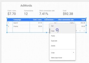
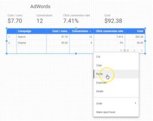
Move the table and resize it to your specifications.
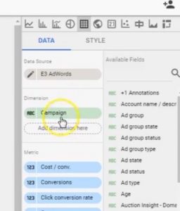
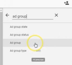
Select the dimension picker and search for ad groups.
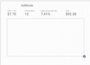
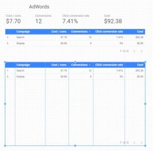
Let’s look at the AdWords cost per conversion report.
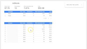
That’s a good looking report.
Watch the video at 5:51 to see how to add the Facebook data.
Hi. I’m Daniel from OnlineMarketingTechs.com and today, I would like to show you some of the Google Data Studio Connectors. Data Studio. Now Google Data Studio is one of the best analytics reporting platforms that there is. It allows you to import different analytics or online marketing data sources into one place to where you can view real-time reports, update, and really parse out data that you’re not allowed to do on a lot of the individual analytics platforms.
Now, most of these connectors are paid connectors. You have to pay for them. But, they are worth it for some marketers. If you don’t need some of these extra features, then I recommend not getting them. But, if you do, I highly recommend these platforms or one of these connectors that would work best for you and use it for your business. I’m just going to go briefly through some of these connectors so you can see what they have to offer.
Here’s Supermetrics. You’re going to see them a lot. That may be one of the options that you will want to go with. With them, you can import all sorts of social media platforms and their analytics reporting. Bing, AdWords, it’s really fantastic. In fact, we’ll go ahead and look at their landing page real quick so you can see some of the cool stuff. So, you can get a free 14-day trial to see if it’s right for you, or you can buy it now. Here’s a template. That’s a template for Facebook or multiple campaigns. But they’re $19 a month.
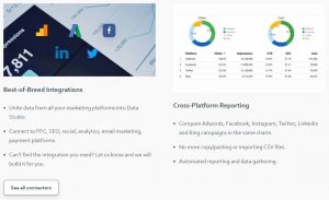
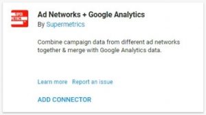
You can unite the data for multiple marketing platforms into the data studio. From PPC, social, email, payment platforms, and all types of different really cool stuff. And if you can’t find out the right integration, they will build one. That’s how good these guys are. Cross-platform reporting. So, in the same charts, you can add multiple connections into the same charts like AdWords, Facebook, Instagram, Twitter, LinkedIn and Bing and all that stuff. If you’ve been doing this before, you don’t have to report CSV files or connect your Google Datasheet (which can be daunting for a lot of advertisers).It gives you automatic reporting and real-time updating. Supermetrics has a lot of really cool things. In fact, a lot of the other connectors that we are going to be showing are from Supermetrics.
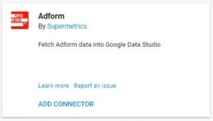
So, they also have Adform. Adform is a marketing platform and Supermetrics allows you to pull your data from that. If you are familiar with Adform, you will be able to pull this in. If you’re not familiar with Adform, this doesn’t matter to you.
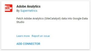
Adobe Analytics… there are a lot of advertisers using Adobe Analytics. It’s a phenomenal platform. Adobe doesn’t do anything that’s not excellent. so, that’s just a fact. So, if you’re using Adobe Analytics, you can import this into data studio and pull from multiple sources.
AdRoll… if you’re using AdRoll, you can import this information. This is from Power My Analytics. Power My Analytics is like Supermetrics. The work a lot, as you can see down here with Amazon and some of these other product selling platforms. If you’re using AdRoll, this may be the way to go for your business.
AdStage is also another automated enterprise platform that would be really excellent to bring into Data Studio, if that’s for you it’s another paid platform.
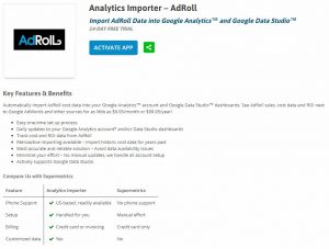
In fact, let me go back to Power My Analytics and look at their landing page. Let’s see what they have to say. This is the landing page specifically for the AdRoll connector when you activate the app. You can get a 14 day trial just like the others. It’s $9.95 a month. Easy one-time process. Updates you Google Analytics account… Data Studio… tracks ROI from AdRoll. If you’re not familiar with AdRoll, AdRoll they have over 250 advertising platforms that they publish advertising content to. So, it’s really Cool. If you’re using AdRoll, this might be the way to go for you. Let’s go back here.
Now you can automatically get AdWords accounts into Data Studio, but this connector allows you to apply multiple accounts to the same report or the same widget as well. It’s pretty cool, I think you’ll like it. If that’s something you’re interested in. Supermetrics might be the way to go for you.
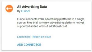
All Advertising Data by Funnel. It connects 250+ advertising platforms int0 one source. There’s a free trial for them. You might want to check them out. I’m just going to breeze through the rest of these. Some of these might be right for you, but some of them might not.
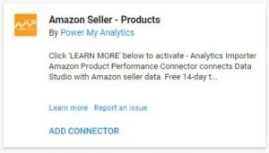
Products…import the data from that. Same thing. Once you have Power My Analytics, you can add this connector as well.
This may be a great way to go for your business if that’s what you need.
Joins data sets, gets unsampled data from Google Analytics accounts, connects to SQL Server, Redshift, Oracle and more. So, if you want a more tech reporting from your SQL Server and multiple Google Analytics accounts, Redshift, Oracle; you might want to check this out.
Create your own custom reporting using CallRail’s attribution data from your online campaigns through CallRail’s integration. That’s really cool to get some call reporting into your reports.
This is a connector that allows users to create reports with data pulled from one or more data.world datasets using SQL queries. That’s pretty cool.
If you use the DoubleClick Ad exchange, you can view some of the analytics from Supermetrics.
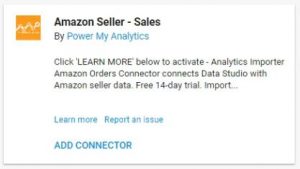
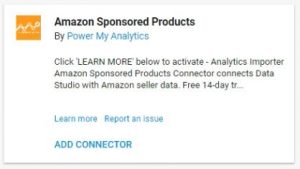
If you’re a product seller using eBay or Amazon, Power My Analytics looks like they might be worth the purchase for your business.

Will fetch facebook page insights into your Google Data Studio.
You’ll see that these are the two top ones. There are a lot of competing ones. Power My Analytics is really more for products. Supermetrics has really awesome social media, from my experience, social media integrations and connectors.

Google Search Console data would be really cool to have in your reporting. You can pull some of these reports from your Google Analytics if you already have this connected to your analytics, but you can also pull it from here.
This is a big one for many businesses. MailChimp… you might want to get Supermetrics for that.
Fetch project ranking data from Marketing Miner into Google Data Studio. So, if you use Marketing Miner, you might want to check out their connector.

This is a free connector that connects to the Facebook Marketing API from Mito. Google actually sent me an email that turned me on to this, and I was like “Yeah, way cool. I like it.” So, I definitely had to check it out. It’s from Mito. You might want to add that connector. At least check it out because Google Data Studio doesn’t automatically have support for Facebook. But if you use Google Sheets and you know how to integrate it with Data Studio, then you can pull the information from that, but it’s not for everybody for sure. So, I really like that they have this one.
Reddit is really cool. So, you may want to pull some data from there. Supermetrics is really, really awesome.

This is kind of new. Being able to have this information could be a game changer for many businesses that use Salesforce. I definitely recommend that if you’re using Salesforce, check this out.
SEMrush is a competitive web analytics research tool. It’s really really cool. I like SEMrush a lot. You can pull a lot of competitive metrics. Basically, you can find out how you’re performing on the search engines and across the web; and how your competitors are. SEMrush is really cool. If you have that, you can pull that information in by Supermetrics.
If you use Stripe, you can pull all of that information in.
If you’re using Twilio for your calls, then definitely check out this.
Here are some open source community connectors and these are really really really cool because they’re free.
Learn more about these. Just go in and find out what’s right for your business or your clients and use these connectors to get the most out of your business if it’s right for you. I highly recommend it.
If you need more help with your online marketing or your analytics reporting, contact us at onlinemarketingtechs.com. Have an excellent day.
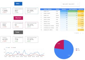
One of our clients wanted to perform a test to see how a specific targeting for an online marketing campaign would affect gender conversions. Data studio provides the ability to build a demographics gender report to view and share with your client’s, partners, or associates. My love of Google Data Studio gave me the inspiration to generate this gender conversion report. The report allowed us to see with great detail if the targeting test was successful or not. Hope it helps you with your gender conversion reporting.
Want to see how Online Marketing Techs can help you with your online marketing?

online marketing analytics tips & tricks
Okay, so today I’m going to be showing you how to build a gender report in Google Data Studio pulling from your Google Analytics. So, let’s get started. Just type Google Data Studio into Google. Pull it up. Then you can select a template, but we’re going to select a blank report. Title it Gender Report.
Now, we need to add a data source. You can select from ones that you’ve already connected or you will need to connect to a new one. We’ll go in there and connect to Google Analytics and select the account, property, and view. Connect. Alright, you’ll want to add that to the report. Click on that. But, I’m going to select one that I already have. There we go. We’ll add it to the report.
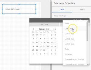
Alight, so we’re going to start out with a date range. You’re going to want to select what date you want to pull the data from. We’re going to go ahead and select the date range to automatically be 30 days. You can change this on the front side to be whatever date you want. But, for now, we’re going to set it to be 30 days.
Now, we’re going to build out the labels. Make it a little bigger. I’m going to make it white because I want it on a blue background. I’ll type in men. Make the background blue.
Now, we’re going to insert a scorecard.
It’s automatically set to sessions. We want the sessions in there for sure. We’re going to compare it to the previous period. So, this is the previous 30 days. We’re going to make a little blue box around it.
So, I’ve got my sessions in there. I’m going to add a filter so it only shows from the men. I’ll select include, gender is equal to male. Save. Now I have my filter. I’ll go ahead and copy that. Paste. Move it over.
Now, I want to select a different metric (in my metric picker) I want to select completions (goal completions). You can select any goal completions you want, but I’m going to go with all of them right now. It’s a total overview. Copy that. Paste. Select the new metric. I want to know the conversion rate. There it is. Be sure we have our filters on them. There’s our men category, sessions, goal completions, goal conversion rate. I’m going to select them all and copy. Paste. I’m going to change the name to women. I want to make it a specific color so I can tell the difference. You can make it any color you want.
Now, I’m going to make a table so I can view the different data sources and mediums that different genders come from. So, it automatically has all the sessions from the different sources, but I want to see the different sources and mediums. So I’m going to type in source and select Source / Medium. I want to know what gender it’s from. So I add another dimension gender. Select metric goal completions. Select a new metric conversion rate. You can adjust them to be the right size. However, you want to do it.
Now, I’m going to make a little heatmap that will show the highest numbers at the top. It will basically tell you what’s performing best for that metric. What’s getting the highest numerical value? You can adjust the colors to be whatever you want. There you go.
I’m going to add a new pie chart so we can basically see who’s getting the most men or women. We want to know which ones have completed the goals. When we’re working with these pie charts you can select how many different pie slices you want. This one you only have the two options because of gender. Men and women are the only options that you have. You can change the color. You can change the color of the pie slices. It’s pretty fun to work with.
Alright, so now I’m going to make the time series so we know which days we had which action from which gender. We want to know goal completions. We’ll add the secondary dimension as gender because the first one is time. And, there it is.
You can also show how many show on the first page or part of the widget. 20, 10 different ones. You know. This one only has 10 so it will only show 10. You can mess around with that. You can view it. Make it look how you want. This is a pretty cool report.
Let’s not forget. We need to go back and we need to change the filter for the women. Create a new filter. This should be the women filter. Include gender is equal to female. There you have your filter. You’ll apply it to the appropriate fields ( the appropriate widgets).
Now we have the men and the women, but there’s an unknown gender amount. So, we’re going to have the total. If you add together the men and the women you’ll have the ones that you know and you take that and subtract that from the total, you’ll have the unknown gender (the ones that Google doesn’t know or don’t provide). Let’s make this one gray. There you go. let’s get rid of the filter. There you have it.
That’s your gender report. You can view it. You can change the date ranges and get all the right data that you need.
You can also duplicate this page. Let’s say we only want to show one that is coming through from AdWords. You can duplicate and rename this page AdWords. Let’s rename the first page to total. We’ll want to leave the source because this is all coming from one source. We’ll add the filter. Create the filter. I already created it, but I’m going to show you how I created it. We’ll go into there. The Source / Medium is google / cpc. Include Source / Medium equals to google / cpc. Save.
Now you will go through and add this to all of the widgets. You can do this for any source. You can make your own filters. Feel free to play around with it to get the data you want. Arrange it to where it looks the best for you. There it is.
I hope you guys liked it a lot and were able to build your own gender conversion data. Feel free to subscribe and thanks for watching. Bye.
Want to see how Online Marketing Techs can help you with your online marketing?
Recent Comments